Spend Analytics
Manage and submit reclassification request from the analytics ribbon
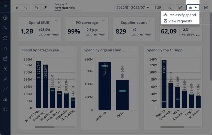
We have changed reclassification request button in the analytics ribbon to a drop-down as seen on the image below. The view all requests link on the request submission popup has been removed as it is now more user friendly to access the list directly from the dashboards instead of creating a false request. This will make it much easier for users to find and manage their pending requests.
Improved visibility to reclassification requests
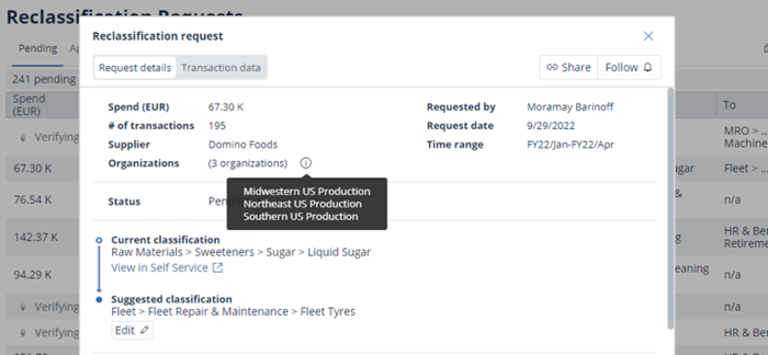
We now display to which organizations a reclassification request belongs to. Depending on your setup, the organization information can be region, operating company, business unit or something else. The organization information provides more context to the request, and it is particularly relevant for decentralized organizations to determine who should be reviewing a particular request.
We have also introduced a new “verifying” state of reclassifications triggered from analytics. With this change we can ensure more secure data handling by capturing all the changes that may happen to the reclassified transactions. In addition to more accurate data representation, this will also mean that every request will always have up to date information on the organization dimension, which will enable us to release organizational responsibilities functionality in the future.
Lastly, the Transaction data tab will no longer be available after 30 days of a request being approved or discarded. With the new state of verifying the requests, we ensure that data behind a request remains up to date, however after having the request reach its final state, we will stop refreshing the data. We instead want to encourage you to review the needed information by viewing the request in Analytics via “Open in Self service”.
More resilient Transaction data export
We have done improvements so that transaction data exports from Spend analytics are more reliable than before. Thank you for you continuous feedback, we are continuously working towards you getting your data as quickly as possible, in any format you need it.
New keywords from free text fields in classifications
With our latest changes, we are able to identify even more relevant words to be utilized in Product classifications in cases where master data fields are not reliable or existent. For example in cases of indirect purchases, where only the invoice line description provides meaningful information. We will be taking this into use in the cases where it makes the most sense if you have our Classification service contracted.
Analytics
Expand view option now available for charts
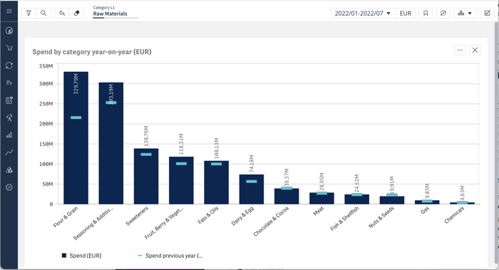
It’s now possible to expand any chart to be full screen, by selecting the expand view option from charts in standard Sievo dashboards. Filters and drill downs still work as normal when in the expanded view. This is a much requested feature that helps you focus on e.g. a specific insight and see all the details of the chart. Pro tip: you can even export the full screen image. giving you a higher resolution export.
Charts and options menus are now more keyboard navigable
We made some adjustments to our menus, meaning that it’s now a bit easier to navigate charts and their options menus using a keyboard.
New options for Pivot table expansion
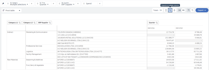
We now added a new option for expanding pivot tables, which enables users to expand into new columns, instead of expanding everything in one column.
Savings Lifecycle
Savings analytics now refreshes faster than ever
From now on, changes done on the projects will be reflected in the analytics faster than before. We have done improvements to how we load the historical snapshot data to analytics, and in most cases this has cut down the average refresh times with 50-85%. For customers with a lot of historical snapshot data, the improvement can be measured in minutes.
Environmental, Social, and Governance
Change CO2 mapping and add supplier emissions in Sievo
The new CO2 mapping tool allows users to change emission mappings directly in the tool as well as bring in supplier specific emission factors. This update also brings CO2 into its own environment on the left hand menu bar, while showing the relevant dimensions in self-service. We are currently rolling out this feature. Most customers can expect to have the tool in place during October and November. CO2 users can also expect to get more communications on this closer to getting the tool in place. Please note that any custom solutions of CO2 will not be getting the tool into use just yet.
Materials Forecasting
Round creation with visibility to overall source data status
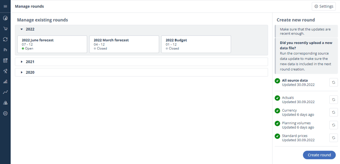
Round creation may have been somewhat frustrating trial-and-error process especially in set-ups where web-uploads have been used to bring in source data for budgets and forecasts. Out first step to make round creation more intuitive for the users is by providing overall visibility to the source data status when creating new rounds. This new feature helps users to determine if source data is in such shape that they can create a new round and also allow them to manually update all source data or specific source data sets if needed. For now, this only provides visibility when source data has been transferred to Materials Forecasting solution. It does not tell when the source data itself has been updated or uploaded - this you still need to check with other means. However, this an area we most likely will improve in the near future.
User Experience
Sievo onboarding tours for new users - Coming soon
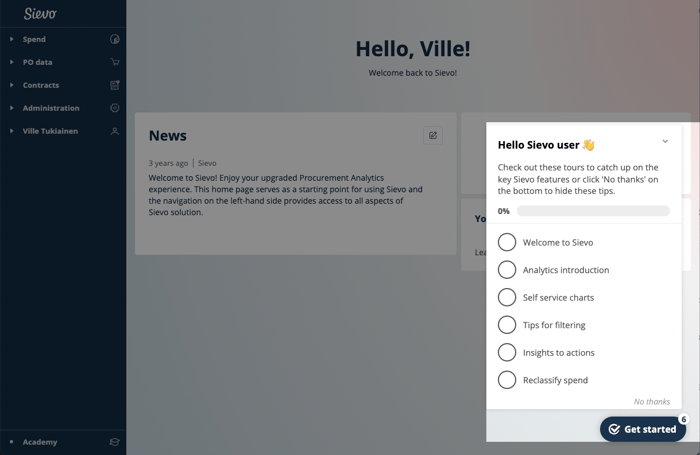
New interactive onboarding tours live on a checklist on the home page, so users can take them at their own pace. The tours introduces users to all the key Sievo features and dashboards. These tours will replace the old single tour, letting users play around with the features between tours, instead of going through everything in one go. The product tours will ensure all Sievo users get to know the basics in a easy and intuitive way.
Gradual training feature tips - Coming soon
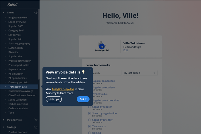
Gradual training feature tips will inform about Sievo features they have not used previously. For example if you have never visited the Transaction data dashboard, you’ll get a popup telling you about the dashboard and guiding you towards Sievo Academy training. To make sure gradual training don’t interrupt work, we’ll only show you one tooltip a month and only for features you have not used previously. You may also opt out of all the gradual training tips at any time. Gradual training ensures our users get to know all the powerful Sievo features.