News & Recognition
A refreshed Sievo: a visual system that best represents our DNA

Mónica Suárez Galindo • Feb 2, 2022
Sievo brand has been elevated. In this blog post, we'll tell you a bit about the process, the reasons behind this new rebrand + a sneak peek at Sievo's new look & feel!
If you place procurement software brands next to each other, and then remove all the logos away. Are you be able to tell who is who?At the beginning of 2021, we saw an opportunity for differentiation and re-positioning that we simply couldn't miss. Somehow procurement software brands have managed to look relatively similar to one another, achieving a more old school/traditional look & feel.
This led us to question ourselves:
-
We have changed a lot over years, and our features and offers have developed. So, after years of growth journey, how would we define us today? Our values, structure and core are still true to themselves, but after years of product and company growth, we needed to rethink our unique factor in the market. After all, our brand represents our product, people and customers.
-
Does our current look truly reflect who we are today? It didn't anymore. Even though our previous branding did well reflect our personality, values and core, it didn't clearly entail what we do and how we do what we do. So, just as back in 2017, in a procurement analytics industry full of stock images and some old-fashioned graphic elements - where most of our competitors look very much alike - we found an opportunity to stand out in the market and regain visibility. A fresher look that would match who we are today (bold, clear and genuine) and what we do, how we do it and why.
- Have we managed to keep visually consistent in time? We realized that there was no clear visual system for Sievonians and partners working with the brand. We needed more clear and specific visual guidelines for all customer touch-points that would help us achieve the visual consistency we were missing.
All these reflections combined made sense to us. It was settled then: It was time to stand out again! To renovate our look, redefine ourselves and reemphasize our unique personality and product value.
Although we are not the youngest in the block, we have our ways to stay fresh, innovative, creative and up to date. And we wanted our rebranding to reflect just what is truly happening inside the company: a constant evolution and innovative process.
What was the rebranding process like?
When starting off, we started by trying to understand what Sievo's brand essence was all about.
Jeff Bezos defines a brand as what people talk about you when you are not in the room. And while we do agree, we also think that a brand is how the people inside a company express, act and feel. A brand is not much different from how a human interacts with the world. In fact, if we think about Sievo as a brand, it's easier for us to imagine it as a human. And most likely, its personality will end up being close to most Sievonians's personalities.
As a result, we decided that Sievo’s brand would be built based on our community of people: our company members' personalities + our customers' perceptions. Reason why we gained a better understanding of our brand through customer and internal expert interviews. And once we defined ourselves and were ready to get hands-on with the visual design phase, we partnered with a super talented graphic designer that was able to create a visual language that best reflected our identity.
How the new brand reflects Sievo? (*drumroll*)
A refreshed Sievo
Our personality
Sievo's personality establishes the foundation of the brand. It reflects Sievo's values, working culture and promise to customers. Consistency is the key to building and maintaining a strong, trusted brand personality.
Bold - Brave, Truthful, Challenger
Clear - Straightforward, Direct, Nordic Simplicity
Genuine - Unpretentious, Professional, but not corporate, Relaxed, but with style

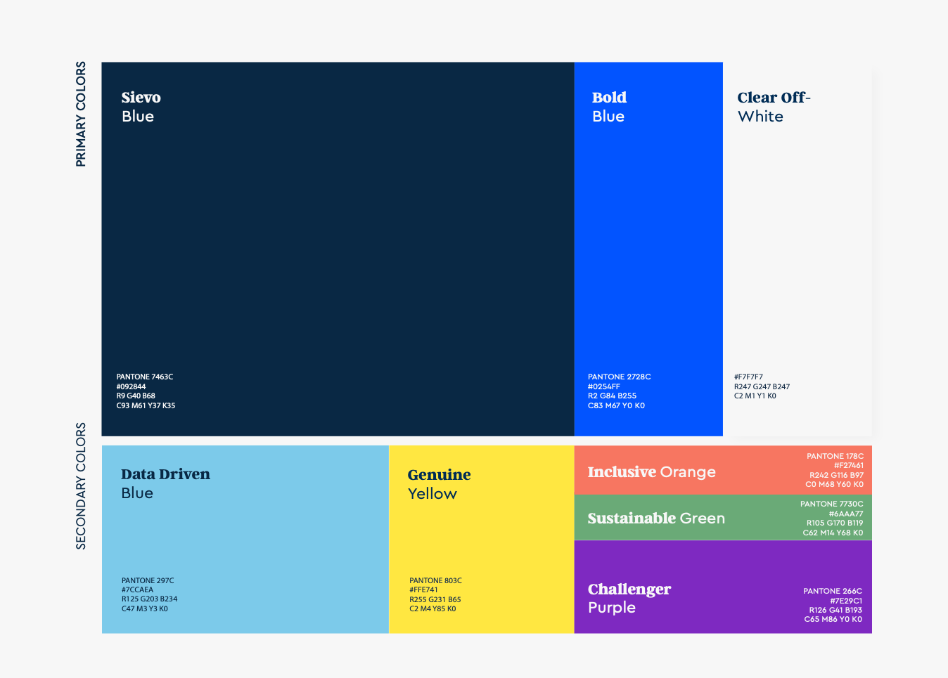
Our true colors
Sievo's color palette is divided into three blocks: Primary / Secondary (1) / Secondary (2).
Primary colors are Sievo blue, Bold blue and Clear off-white.
Secondary colors represent our DNA:
- Data-Driven Blue: Represents technology and innovation, Data and Analytics.
- Challenger Purple: Braveness, Laid-back attitude, Spark.
- Genuine Yellow: Excitement, our brilliance, life and authenticity.
- Inclusive Orange: Human Rights, Equality, Society.
- Sustainable Green: Environment, Nature, Eco-Sustainable.
Clear data-driven shapes
At Sievo we see everything under a data driven mindset. And that is why we transferred our world of data analytics to a visual system.Sievo's graphics make the data driven world in which Sievo lives tangibly. These elements are abstract figures.
- Abstract Analytics: The blue shapes symbolize the analytic world. They are inspired by the traditional charts like pies, bars, waves, etc. These figures should always be combined with the blues of Sievo. It's not allowed to use two secondary colors.
- Data circles: These circles make the data collected by Sievo tangible. Simple, Clean and always active and on the go. These circles should only be used in yellow and purple.
- Lines: The lines should always be over the Abstract shapes and behind the Data circles. These lines represent constant activity and a living brand.

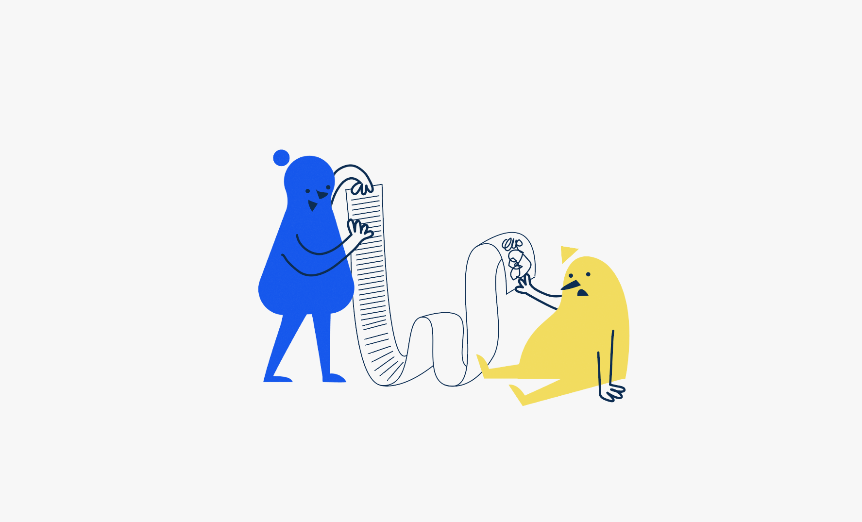
Genuine characters
Sievo has a very playful personality, that's why we have our own cartoon characters. They were created in order to explain Sievo's personality and mindset, and how different we are from the squares mindsets out there.
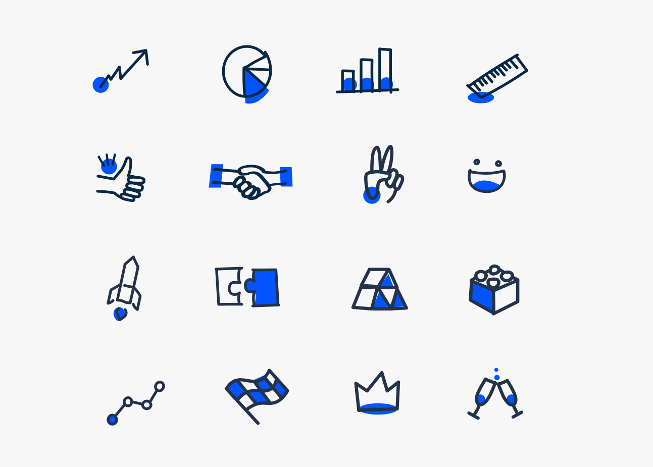
Unique Icons
Sievo's iconographies represent the transparency and awesomeness of the brand. They show this the playful and modern side that will give us balance to connect more closely with the public.
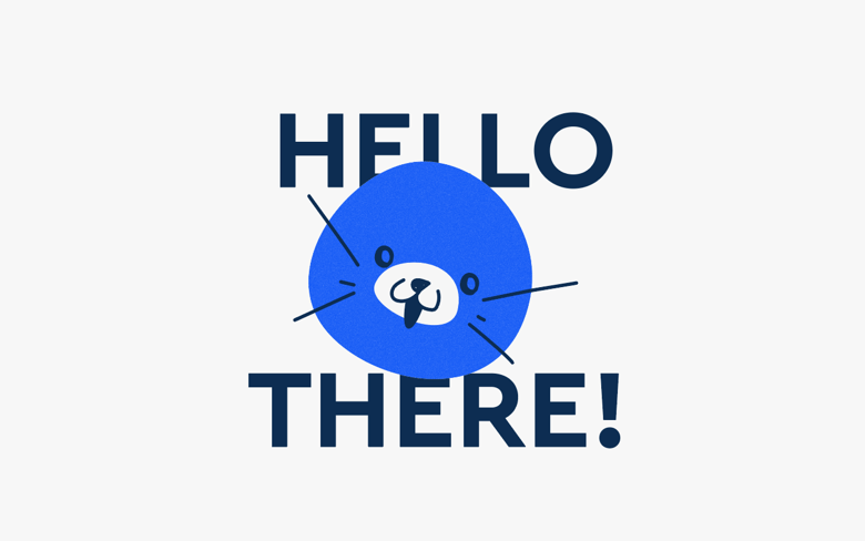
Our lovely mascot, Jaxu
Jaxu is Sievo's pet. Jaxu can appear when we talk about caring and when we’re being playful. With Jaxu is not only about serious business, but a closer relationship. We show our affection and emotions to close friends through Jaxu!
How will the new brand be rolled out?
With a new visual identity comes an ongoing adaption process. The web page will be rolled out gradually to our website, presentations, stickers, hardbacks, event material and digital touchpoints. Sievo tool landing page will get a refresh later on in 2022.
Our product will be progressively adapted to meet our new visual identity. Ville Tukianen, Head of Service Design at Sievo, will keep us all up to date when the time comes. In his own words: "In product side, we want to emphasize the ease of use, modern look, simple and fun experience, familiarity and niceness. We don't want to be the old school corporate product, as playfulness and boldness are driving forces of Sievo in product development." -Ville Tukiainen, Head of Service Design
Today we are proud to say that we have a visual system and identity that best represents our true colours: who we are, what we do and how we do it. We hope to inspire data-driven procurement game-changers to be even b
older and keep pushing the boundaries in the procurement analytics game field!
A refreshed Sievo is here: