

Thought Leadership
How we reduce procurement complexity with usability familiarity
Luca Rossi • Apr 14, 2022
I joined the Sievo UX team as Service Designer about two years ago. I used to work in marketing, and I didn't have experience in procurement before, but I was drawn to Sievo's use of analytics combined with complex user tasks.
By then, the product functionalities were very mature, but the software UI lacked familiarity. Many elements offered unique design solutions that required the users to learn how it works before acting.
After discussing with the team, we saw an opportunity to improve the users' experience. We agreed to embrace the design task of ensuring that the whole Sievo product would offer a consistent and familiar design experience.
Our goal: reduce procurement complexity with usability familiarity.
A familiar design
Procurement analytics ain't a simple science (says the guy who had never heard about Suppliers Tail until two years ago). Users need to compare gigabytes of data from multiple angles to improve their company spend portfolio or deliver on their savings project. They need to quickly jump between filters and category classifications to forecast the cost variance for their indirect spend correctly. And on top of that, each company and user have different ways of organizing, discovering, and interpreting the data.
Sievo's job is to make that happen smoothly for everyone.
Jacobs Law states that "Users spend most of their time on other sites." This means that users prefer your site to work the same way as all the other sites they already know.
Users will always approach new products and features based on what they've used before, and for this reason, we designers should work around these expectations when developing new features.
There are several benefits to this:
-
Reduce learning curve- Users don't have to learn a new system. They can start using your product right away. This allows users to jump right into the product without attending long training sessions and reading documentation, which keeps them from completing their tasks.
-
Boost usage speed- As the user uses a known solution, it helps reduce cognitive strain, thus speeding up the process. Meaning: do more things, faster.
-
Increment user Retention- As there is little/no learning curve involved, and the user can complete their task without much fuss, they will continue using your product compared to the competition who uses an entirely alien solution.
But how does one creates a familiar interface? Let's explain it with an example.
The Self Service dashboard update
A good example of building a familiar interface is the Self Service dashboard update, which happened at the beginning of 2021. The Self Service dashboard has always been one of the most beloved tools in Sievo: it allows users to analyze the data however they prefer by freely selecting any Dimensions & Measures and rendering them in a dynamic and interactive form such as charts, tables, and pivot tables.
The old version of the dashboard offered great functionalities. Still, they presented in an unfamiliar fashion: there was little information about the role and response of the interactive elements shown to the users. For example, the users can reshuffle the order of Dimensions and Measures from the top area, which allows them to read the data from a different perspective. Yet, there is no familiar visual cue for this. The result was that some users were unaware of certain functionalities.
The old Self Service dashboard
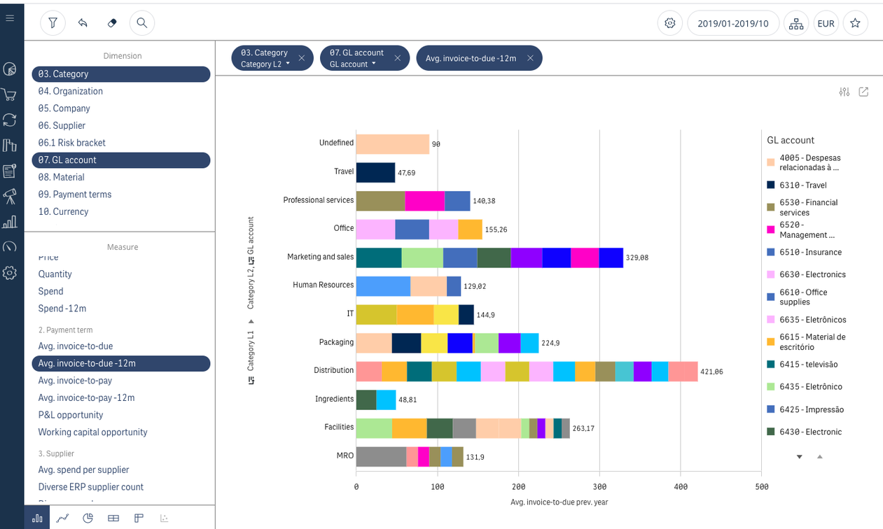
The interactive elements are present, but they do not communicate their functionalities in a familiar fashion.
The new self-service dashboard
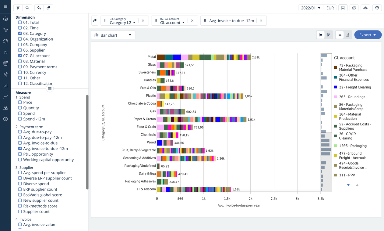
The interactive elements present their functionalities using familiar patterns, such as checkboxes, drop-downs, and labels.
After analyzing the usage of the dashboard, we worked on an updated version of the layout: we aimed to maintain the same page structure (which was well organized and familiar to all our users) while making the interactive items explicit in a familiar fashion! The result was a success: the number of hours of training necessary to learn the tool decreased with the requests for help sent to our support center. At the same time, we noticed an increase in the usage of some of the functionalities.
Old vs. New Self Service UI
-
The Dimensions and Measures can be turned on and off at the user's convenience. After the update, it is now easier for the user to identify what kind of action is available.
-
Did you know you can adjust the position of the line between Dimensions and Measures? After the update, the items show a handle icon which suggests to the user the possible action.
-
The Chart selector type was hidden to certain users (sitting at the bottom of the left column); it is now in a more prominent position, along with labels that help the users identify the chart type.
Onwards
It has been over one year since we updated the Self Service designs; since then, we have continued improving existing interfaces while developing new services. For example, we built a responsive and accessible Design Library that comprehends several reusable components, which simplifies the work of designers and developers while keeping the experience of the users consistent and familiar. That was not an easy job! But we will tell you more about it in another post.